Template talk:Elem Infobox: Difference between revisions
imported>Robert W King |
imported>David Yamakuchi |
||
| Line 98: | Line 98: | ||
Don't use periodic on this template. Use it on the according element page. --[[User:Robert W King|Robert W King]] 20:08, 5 April 2008 (CDT) | Don't use periodic on this template. Use it on the according element page. --[[User:Robert W King|Robert W King]] 20:08, 5 April 2008 (CDT) | ||
:I jacked up the implementation. There has to be some kind of logic on {{tl|periodic}} that indicates which little box should be highlighted. --[[User:Robert W King|Robert W King]] 20:13, 5 April 2008 (CDT) | :I jacked up the implementation. There has to be some kind of logic on {{tl|periodic}} that indicates which little box should be highlighted. --[[User:Robert W King|Robert W King]] 20:13, 5 April 2008 (CDT) | ||
Well, we've got something...I'm just not sure how to use it without hosing the links in the infobox...Anyone???? | |||
{{Periodic|elSym=Pb|elGroup=Metal|elementColor=#000000}} | |||
{{Elem_Infobox | |||
|background1=ffffff | |||
|align=left | |||
|elementColor=f5f5f5 | |||
|elName=Lead | |||
|elMass=207.2 | |||
|elSym=Pb | |||
|elNum=82 | |||
|eltrnCfg=[Xe]6s<sup>2</sup>4f<sup>14</sup>5d<sup>10</sup>6p<sup>2</sup> | |||
|no1= +2 | |||
|no2= +4 | |||
|no3= | |||
|no4= | |||
|properties= [[corrosion]]-resistant, [[density|dense]], [[ductility|ductile]], and [[malleability|malleable]] blue-gray [[transition metal]] | |||
|compounds= | |||
|uses= | |||
|hazard= toxic | |||
}}{{Periodic|elSym=H|elGroup=Alkali Metal|elementColor=#000000}} | |||
<br /><br /><br /><br /><br />{{Periodic|elSym=He|elGroup=Noble Gas|elementColor=#000000}} | |||
<br /><br /><br /><br /><br />{{Periodic|elSym=Si|elGroup=Metalloid|elementColor=#000000}} | |||
<br /><br /><br /><br /><br /><br /><br /><br /> | |||
== New box comments == | == New box comments == | ||
Revision as of 19:25, 7 April 2008
Chem_Infobox
- background1=aaccff (the color of the background)
- elementColor=xxxxxx (the color of the element square)
- elName=Helium (element name)
- elMass=0 (element mass)
- elSym=He (element symbol)
- elNum=2 (atomic number)
- eltrnCfg=1-1 (electron confguration
- no1=1 (oxidation states)
- no2=1
- no3=1
- no4=1
- properties=Describe what it looks like
- compounds=What is it found in?
- uses=(uses)
- hazard=what type of hazard does it pose?
what does element color mean?
I don't see anywhere what the definition is for the elementColor variable. Is there a set of colors which indicate something about the element or is it up to each element author to choose any color they like? I just kept a red color for my Boron page. Is this correct? Does it matter? David E. Volk 09:33, 6 December 2007 (CST)
Fix
There's a white margin on the left side that needs to be fixed. Also, I think some elements are better left justified, while some look better centered (I don't think they should all be centered). Thirdly, I think the picture being there is somewhat worthless. Instead we should be giving the period in which it resides so people can look it up in a much better formatted table, if they wish. --Robert W King 09:19, 4 April 2008 (CDT)
- What do you mean by centered? Could be another browser issue. Chris Day 10:59, 4 April 2008 (CDT)
- The white margin is still there. And I mean center-justified text in some of the tables. --Robert W King 11:06, 4 April 2008 (CDT)
- The white margin on the side is a "keepout" for the article text. Look at all the other structures in CZ...they've got 'em. The page looks crowded otherwise.
- Left-right-center whatever...
- The PT thumbnail is there so the person has a clue where to start looking on the table once they get one with any resolution.
- --David Yamakuchi 12:02, 4 April 2008 (CDT)
- No, this is the only structure that has it. No other templates have this visible margin. Please, I do not wish to get into a debate over this. --Robert W King 12:04, 4 April 2008 (CDT)
- The white margin is still there. And I mean center-justified text in some of the tables. --Robert W King 11:06, 4 April 2008 (CDT)
Screenshot
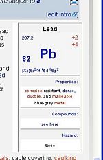
Robert, here is a screen shot from my browser, is this what you are seeing?
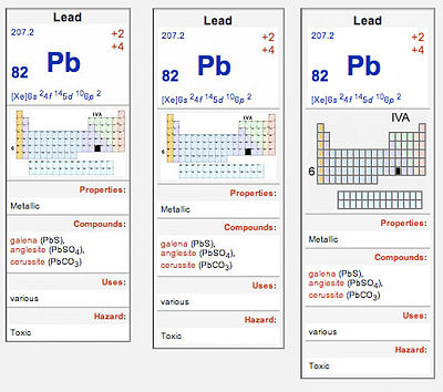
In this example, the one up as I post, I have included a simplfied periodic table. The text (6 and IVA) ned to be bigger in the picture. Also the box lines need to be thicker and the atomic numbers axed too. I did not have time to get it perfect, but you get the idea.
I prefer the one on the right with extra padding so the dividing lines don't go all the way across. I think more work on the background colours is needed. However, if mine looks completely different to yours there are more fundamental issues to solve. I did delete out a lot of code that was not necessary, for my browswer at least. It might be required for IE? Chris Day 12:06, 4 April 2008 (CDT)
- I'm not worried about the padding, it looks fine either way. And I agree with the current picture of the table, it looks better. Less is definately more. But this is what I'm talking about . Also notice, my text is not left-justified. --Robert W King 12:11, 4 April 2008 (CDT)
- It never ceases to amaze me how different the wikimarkup functions on different browsers. The justification is easy to fix, for some reason i.e. default is center compared to Safari's left.
- The margin I'm not sure about. In mine that margin has the background colour therefore cannot be seen. For some reason your the background colour is not being added in yours and its defaulting to ffffff. That is not an extra colomn but an extra surrounding the whole infobox, the table inside is then aligned right within. I can probably just get rid of that table, I'm not sure how important it is. Chris Day 12:19, 4 April 2008 (CDT)
- It solves the problem, but it confuses mediawiki on word-wrapping. Can we just make it the same size as the template? MW has built in code to solve spacing around tables and pictures. --Robert W King 12:42, 4 April 2008 (CDT)
- I can add the 'no word wrapping' back, what is the exact problem? I don't see any difference? Chris Day 12:43, 4 April 2008 (CDT)
- It solves the problem, but it confuses mediawiki on word-wrapping. Can we just make it the same size as the template? MW has built in code to solve spacing around tables and pictures. --Robert W King 12:42, 4 April 2008 (CDT)
Periodicity within the template
Instead of including a miniature picture, why not just code it into the template so you can put the "IVA" on the top and "6" on the left? I'm not thrilled by the prospect of having to create jpeg pictographs for every single element.
- The most important thing in the picture is the black square. That means you have to have a different picture for each element. So you may as well add the text to the picture. As long as the picture names are predictable they can be called up automatically according to the element name. In that way we can just discard the image field altogether. Making a bunch of pictures, one for each element, would not take that long. I'll be happy to do it, but I want to wait and see if there is interest. I could code David's example info box so you can see how the pcitures would get called up in the background. Chris Day 12:23, 4 April 2008 (CDT)
- Just so you know it's about 90 pictures. I hope you're okay with that. It'll be like half-a-day's work. I'm thinking it can probably be done in CSS dynamically, but I have yet to try it out. --Robert W King 12:29, 4 April 2008 (CDT)
- I think it could be done dynamically BUT would it work in all browsers, sigh. I think making the pictures is easiest. Once the template is made it will be very fast to cutomise each one. Chris Day 12:35, 4 April 2008 (CDT)
- I am going to attempt to make a template. --Robert W King 12:43, 4 April 2008 (CDT)
- OK I'l wait and see how that turns out first. Chris Day 12:44, 4 April 2008 (CDT)
- I am going to attempt to make a template. --Robert W King 12:43, 4 April 2008 (CDT)
- I'd be somewhat dubious about including much text in the images for a couple of reason. One, there's a resolution issue: on screens with very small pixels, people with poor eyesight might have a hard time reading small characters (size issues are presumably part of the reason to include them in the image, so I'd assuming, perhaps incorrectly, that you'd be making them small). More important, for the visually impaired, who use reading software, that software can't read a picture. J. Noel Chiappa 19:28, 4 April 2008 (CDT)
New infobox
I kind of like the new elem infobox with the links for oxidation state and so on. :) David E. Volk 13:58, 4 April 2008 (CDT)
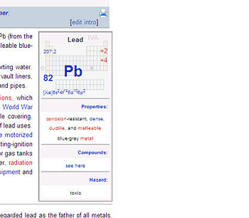
- Does anybody know a way besides photoshop to make somethng like this happen (see right, 15% opacity)?--David Yamakuchi 02:16, 5 April 2008 (CDT)
Template
I'm about to start up work on the template version of the small table. --Robert W King 11:31, 5 April 2008 (CDT)
Another option
Working with David's opacity theme here is another possible style that migth be even more informative. Since the other elements in the group become more obvious. Chris Day 11:33, 5 April 2008 (CDT)
- What are the dimensions of each of those little boxes in pixels? --Robert W King 11:36, 5 April 2008 (CDT)
- If we stick with 140px, it should fit in the Infobox wthout stretching the table.--David Yamakuchi 11:55, 5 April 2008 (CDT)
- See Template:Periodic so far. --Robert W King 11:56, 5 April 2008 (CDT)
- If we stick with 140px, it should fit in the Infobox wthout stretching the table.--David Yamakuchi 11:55, 5 April 2008 (CDT)
- needs tweaking of course, but this is the basic idea. Should look the same under both firefox and IE.--Robert W King 12:22, 5 April 2008 (CDT)
- Ok, so opacity works now, just need to find out how to get it put behind the main stuff. --Robert W King 16:37, 5 April 2008 (CDT)
- I got it! almost... --Robert W King 19:18, 5 April 2008 (CDT)
- Ok, so opacity works now, just need to find out how to get it put behind the main stuff. --Robert W King 16:37, 5 April 2008 (CDT)
Use of {{periodic}}
Don't use periodic on this template. Use it on the according element page. --Robert W King 20:08, 5 April 2008 (CDT)
- I jacked up the implementation. There has to be some kind of logic on {{periodic}} that indicates which little box should be highlighted. --Robert W King 20:13, 5 April 2008 (CDT)
Well, we've got something...I'm just not sure how to use it without hosing the links in the infobox...Anyone????
| |||||||||||||||||||||||||||||||||||||||||||||||||||||||||||||||||||||||||||||||||||||||||||||||||||||||||||||||||||||||||||||||||||||||||||||||||||||||||||||||||||||||||||||||||||||||||||||||||||||||||||
New box comments
Hi, this is looking good. A couple of comments: first, the electron configuration is a little obscure - maybe move that to the data subpage? I'd strongly suggest instead a link to which group of the PT it's in - using names, for the benefit of all the non-chemists in the world, who haven't memorized which numerical group the halogens, noble gasses, etc are :-) That will immediately give a lot of clues to its properties. Second (and I'm less sure about this one), I wonder about the "compounds" and "uses" sections - it seems to me that one can only give a brief gloss on the subject in such a small space, so are those really useful? On the fence a bit about that latter one, I must admit. J. Noel Chiappa 09:02, 6 April 2008 (CDT)
Keepout
Hey what gives? The lines for the article section headlines don't obey the keepout area like the text does...see Gold, Magnesium, etc.--David Yamakuchi 6 April 2008
- What? Are you using the new skin or monobook? --Robert W King 15:45, 6 April 2008 (CDT)
- Also I've made the infobox a div on purpose; because I'll need to use absolute positioning when I put the periodic table behind the data in the upper part of the box. --Robert W King 15:51, 6 April 2008 (CDT)
- Have a look at the Phosphorus page...--David Yamakuchi 15:55, 6 April 2008 (CDT)
- Phosphorus is the only page like that because it's approved (locked) and doesn't have an "align" specification. A constable needs to go in there and fix it. I had to add a new variable "align". It's fixed on the draft and all other pages that use this template. --Robert W King 15:56, 6 April 2008 (CDT)
- Have a look at the Phosphorus page...--David Yamakuchi 15:55, 6 April 2008 (CDT)
- Also I've made the infobox a div on purpose; because I'll need to use absolute positioning when I put the periodic table behind the data in the upper part of the box. --Robert W King 15:51, 6 April 2008 (CDT)


